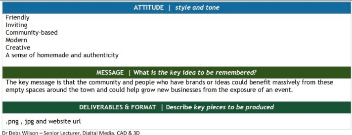
The Brief
Teamwork
Brief Explanation
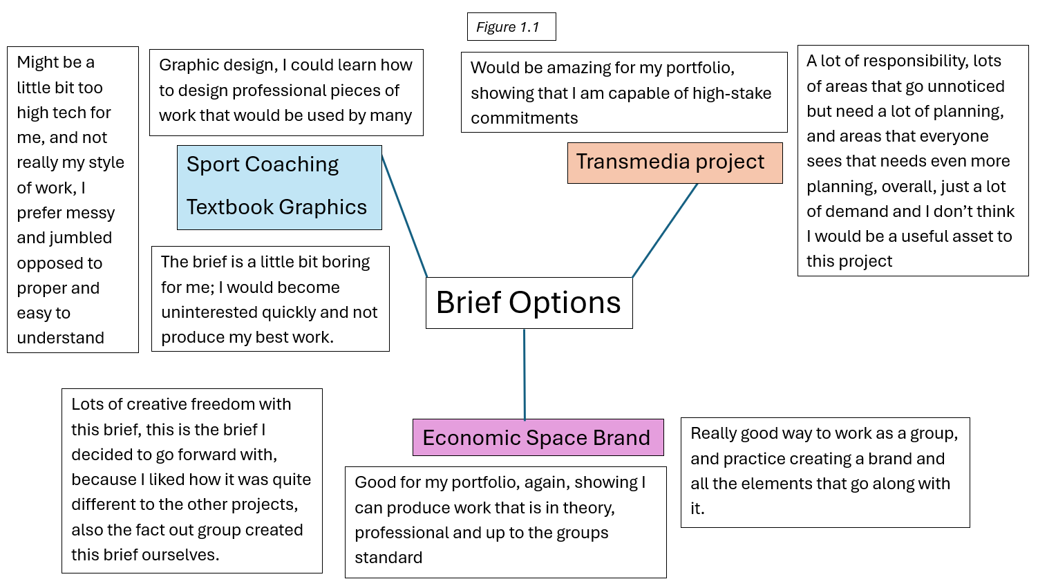
Before starting this project, I explored the briefs that were presented to decide on the project I wanted to be involved with throughout the second semester (figure 1.1). I chose to only look at briefs that really interested me, rather than brief within the same category, because I believed this would motivate me to produce more work. For example, I looked at briefs like “Sports Coaching Textbook Graphics” and “Transmedia Show”, as these projects would help me understand how to design to a professional standard and would help me cater to different visual identities. However, as I had already decided I would be doing the “Economic Space Brand” I didn’t really need to consider any of the other briefs.
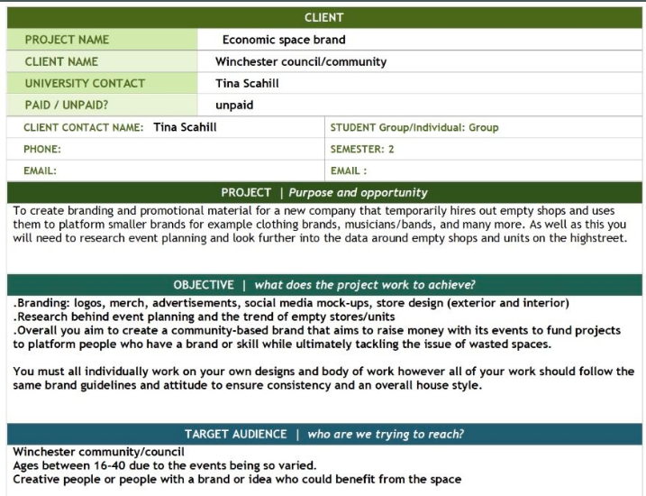
Once I had decided I would go forward with creating a visual identity for the economic space brand, I took a deeper look into what the brief was asking for (Figure1.2). here, I did some research into the background of Our Project and the values the brief holds. I also made sure to take notes from the brief and note the goals and deliverables expected and completed in this project over the semester, so that it would be clear to me how much workload I would be taking on.
Before moving on to planning out the project, I talked to my group on “Instagram”, as this is my preferred method of communication. I ensured that the group chat was accessible to everyone in the group, as we needed to collaborate and communicate about the majority of the elements of the project, and decisions that were made.

Synopsis
Other than myself, six other people were interested in the Economic Space Project. Our group was compiled of all designers, so the first thing we set out to do was set up communication tools (figure 2.1) so that we could all keep on track, and all have access to the same shared information throughout each other’s process during the semester. For communication, we decided to create an Instagram group chat, and also use outlook email to share higher quality pieces of work. We decided on Instagram because all the members of the group had access to it, and it’s a very user-friendly way of communication, so nobody would be left out because we all know how to access different folders and areas within the app.
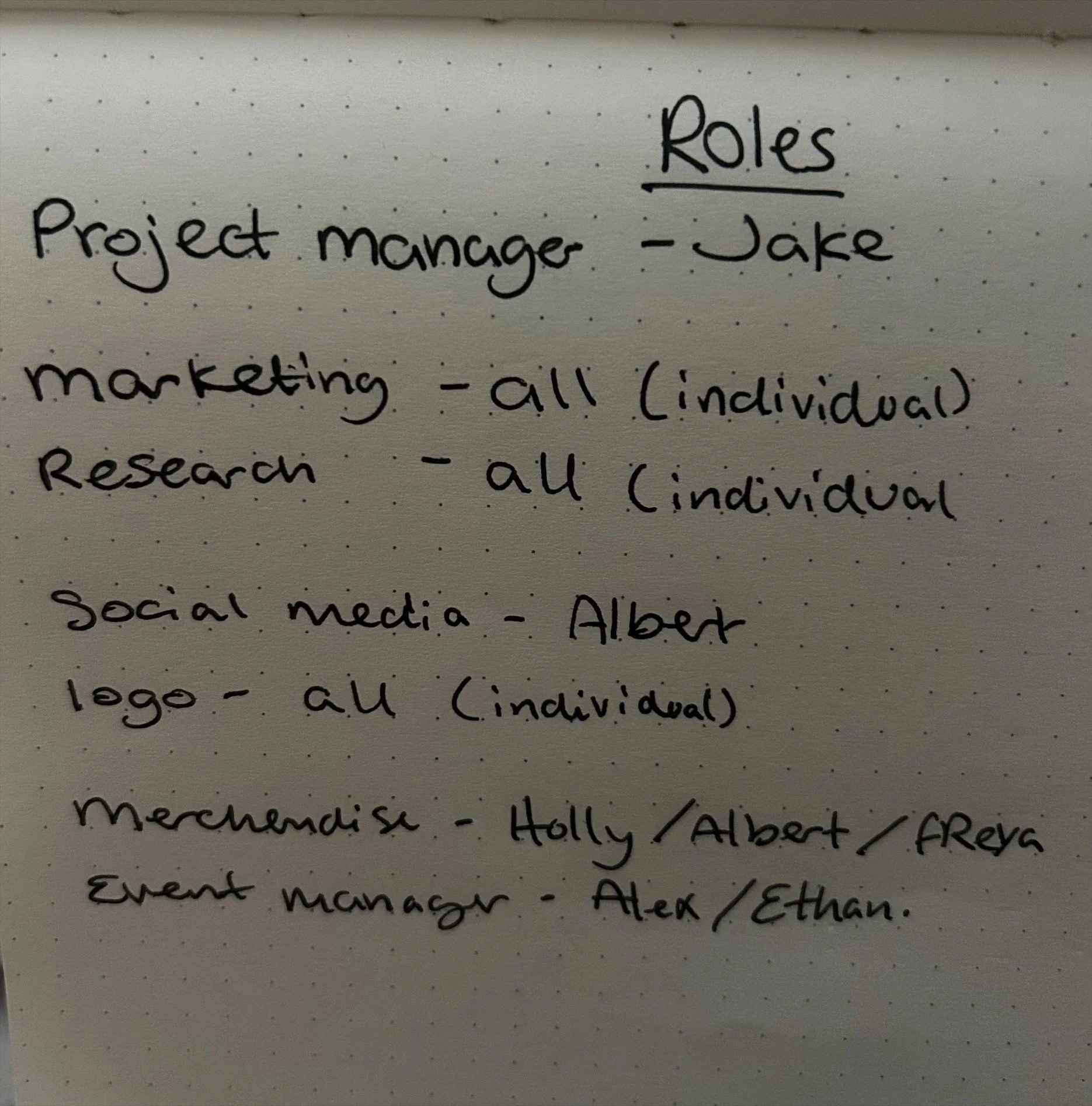
Once we had set up all of the tools we aimed to use throughout the project, the next step was to divide the tasks among us, based on our preferences. To do this, we wrote on a piece of paper and posted it in the group so that we could go back to the list in case we forgot who was doing what. (figure 2.2). applying Belbin’s “team roles” theory, my primary role of “team-worker” seemed to play a part in this project, as I found myself creating a positive and supportive team environment, ensuring everyone was up to date and happy within the project.
Idea Development
Project Research
figure 2.1
choosing the groups
figure 1.2

figure 2.2
during the first semester, we chose our groups by selecting the brief we wanted and working with other students who chose the same brief. in the second semester, we took a more strategic approach. we started by taking the Myers-Briggs personality test. ‘The Myers-Briggs Type Indicator (MBTI) is an assessment tool designed to help you understand how you think and behave. It also provides an insight into how you communicate, interact with others, make decisions, and understand yourself more deeply.
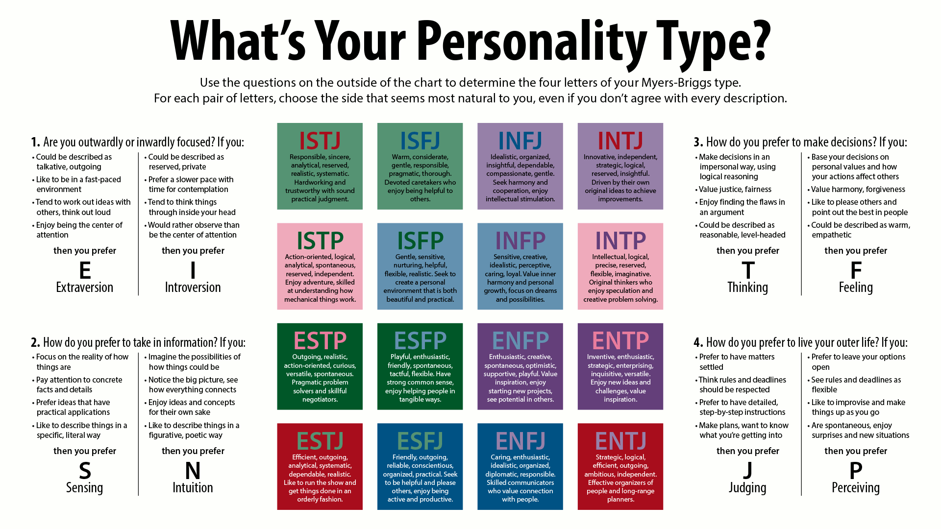
image sourced from,
https://en.wikipedia.org/wiki/Myers%E2%80%93Briggs_Type_Indicator
this was beneficial to us because it helped us to understand what we bring to group projects, where our strengths lie and what our strongest skills are, as well as Highlight what we may lack and, therefore, need in other group members. my personality type is ESFP or Entertainer, This is defined as a ‘personality type with the extroverted, sensing, Feeling, and perspective traits. This is defined as more outgoing, energetic and enjoy being the centre of attention. They tend to be known for their spontaneity, love of social interaction, and the ability to make others laugh.’ (16 personalities). This can then help me to identify that my strengths may include being friendly and having an approachable nature, while also being easily affected by others emotions. However, my weaknesses may be that I am conflict-averse, meaning i avoid conflict entirely, and I am also sensitive, which means I’m ‘strongly emotional and often vulnerable to criticism; they can feel like they've been backed into a corner, sometimes reacting badly.’ (16 personalities). it would be beneficial to have team members who have the INTJ personality type. These are described as having ‘introverted, intuitive, thinking, and judging’ personality traits. They are also ‘known for their strategic, logical, and independent nature, often preferring to work alone and focusing on long-term goals. They are highly analytical and enjoy solving complex problems.’ (16 personalities). Once we identified our personality types, we used the Myers-Briggs cognitive function chart to identify what colours we were, from this we then found our compatible types and formed the most beneficial groups. Once this was done, we then chose a brief.
Who is our client?
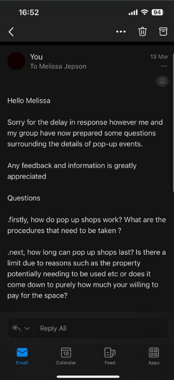
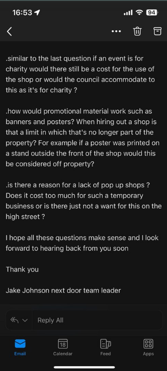
Our client for this project is the Winchester council. Our Lecturer for this module, Tina Scahill, provided us with a contact within the council, Melissa Jessop. Winchester council would be the best client as they have the most up-to-date and accurate information on the city’s economy. We got in touch with Melissa via email and sent over a list of questions, however, we did not receive a response after initial contact. Evidence of Client conversations are below.
To research this project, we started by looking for other companies that provide similar things. We looked at a lot of commercial spaces for rent and a lot of companies that were vaguely similar to us, such as BizSpace and Rubberdesk, which were about renting the spaces to business and start-ups.
As a group, we thought it was important to consider the background of our project. Therefore we looked into the reasons of why it is important for this kind of exposure to help grow smaller businesses? For example, who is your target audience, what will they use your project for, and how will it benefit the surrounding areas or specifically, the economics of said area? As the area we looked into was Winchester, we thought about how setting up a project like next door would help boost Winchester’s economy. This can be linked to SDG8, which is defined as ‘Promote sustained, inclusive and sustainable economic growth, full and productive employment and decent work for all’ (The Global Goals). When thinking of the Next Door project, targets 8.3 and 8.6 fit in well, as the events will need staffing, which will promote job creation as well as being able to promote youth employment and educating them in a way of showing how small business start ups work and run or different ways start a career other than the mainstream ways you see in schools. As well as this, Target 8.9, which is all about promoting sustainable tourism, is also relevant as our store space would be constantly recycled into different events and run mindfully and sustainably by using eco-friendly merchandise options, being mindful of electricity usage, and reducing waste between different pop-ups. This will hopefully provide tourists with a sustainable option when visiting Winchester.
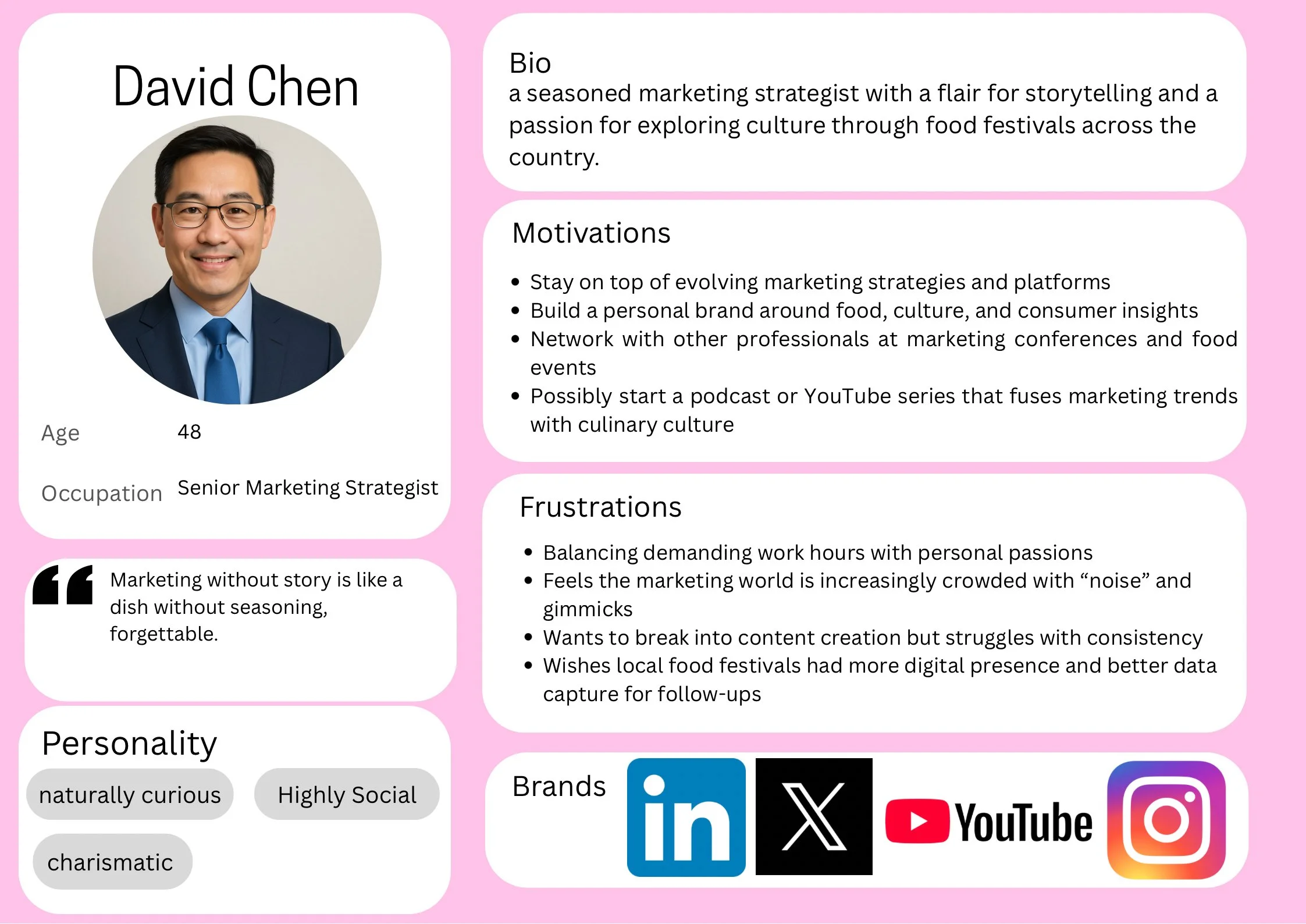
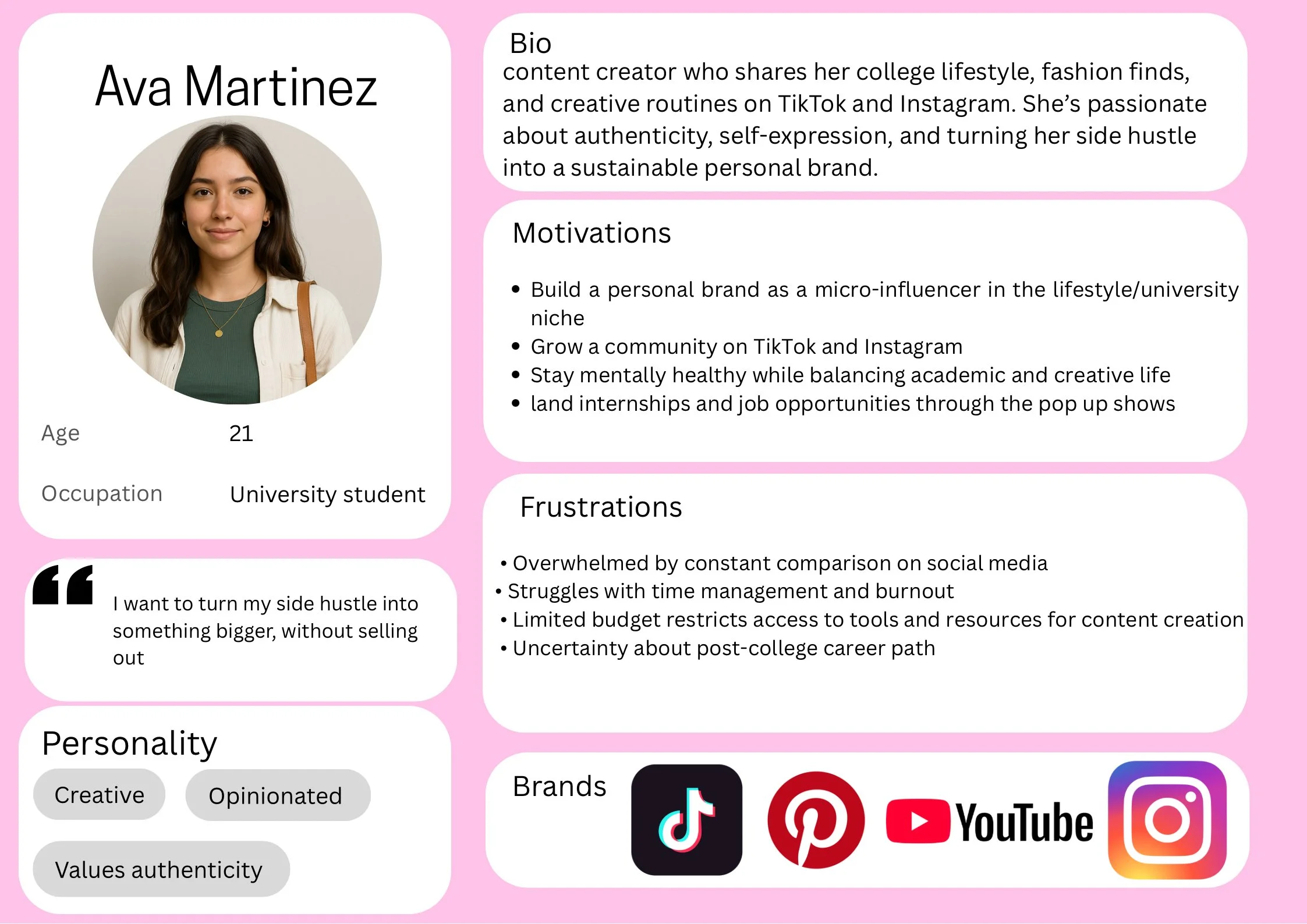
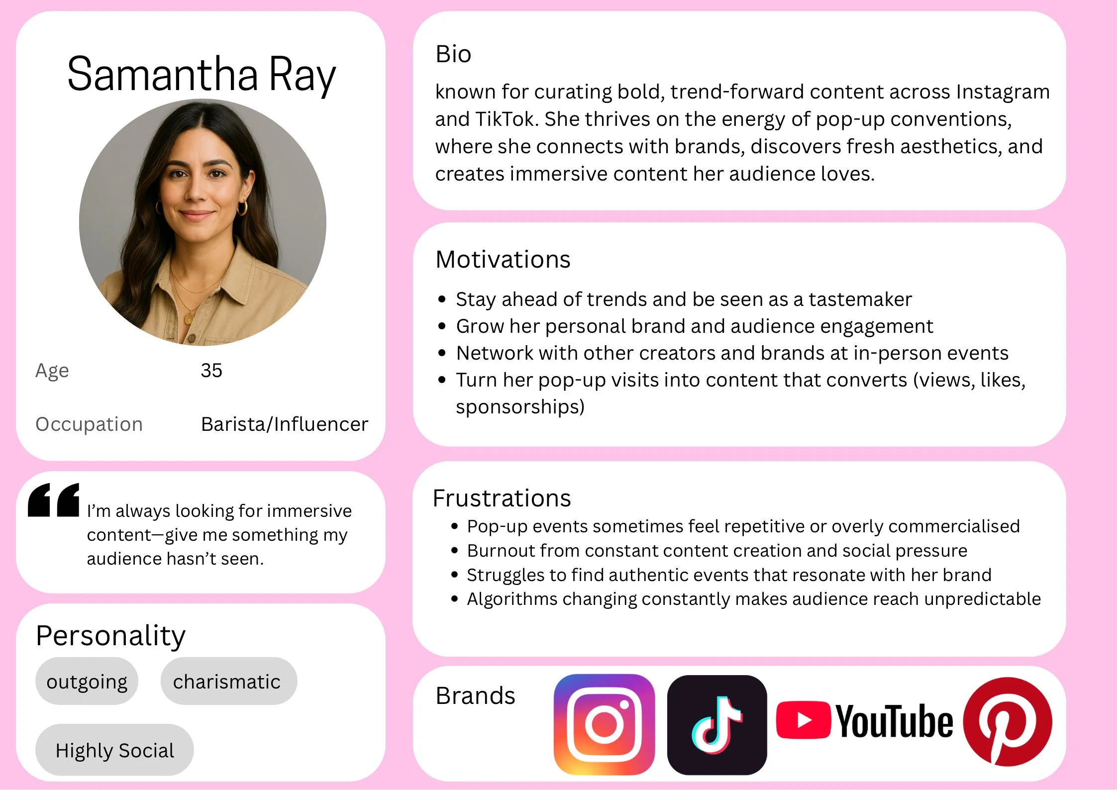
It is also important to think about who our target audience would be. I created three different user personas based on asking my friends and peers what they would like to see in a pop-up shop and what keeps them engaged with different brands, and thinking personally about what I would like to see. Rikke F. D. and Teo, Y. S. (2025). Say that ‘Creating personas will help you understand your users’ needs, experiences, behaviours and goals. Creating personas can help you step out of yourself. It can help you recognise that different people have different needs and expectations, and it can also help you identify with the user you’re designing for.’
Once we completed our primary research, we were able to start developing ideas for the project. Early on, we decided that Jake Johnson would take on the role of project manager, which helped give the group a sense of structure. We then divided responsibilities based on specific tasks, such as logo design, website development, and merchandise creation, which allowed us to focus on different areas of the brand. For the most part, this approach worked well and helped us make steady progress. However, we did face some challenges, particularly around the logo design, which I feel was one of the major setbacks of the project. We didn’t finalise the logo or the brand guidelines until around week five or six, which delayed other parts of the design process. o get back on track, we used a Gantt chart. Because we all have different creative styles, it was difficult to reach a consensus on what best represented Next Door. While some team members liked certain concepts, others didn’t feel they truly reflected the vision of the brand. This disagreement made it hard to move forward confidently in the early stages. That said, apart from the logo issue, we collaborated effectively overall, maintained clear communication, and supported one another throughout the process.
As mentioned above, we started by creating the logo and brand guidelines (Appendix A). Below are examples of some draft logos from different members of the group.
When looking at similar concepts and projects, Gallery 37 in the Brooks shopping centre in the City centre seems to run a similar system of pop-ups, which normally appear to be art-based, sometimes in collaboration with University of Southampton students. There is not much information online about it; however, below are some pictures of the pop-ups.

On the right are initial sketches for the business cards. I wanted to keep it very simple and plain, as that reflects our brand guidelines and font designs. From these sketches, I started to develop the business cards on Canva.

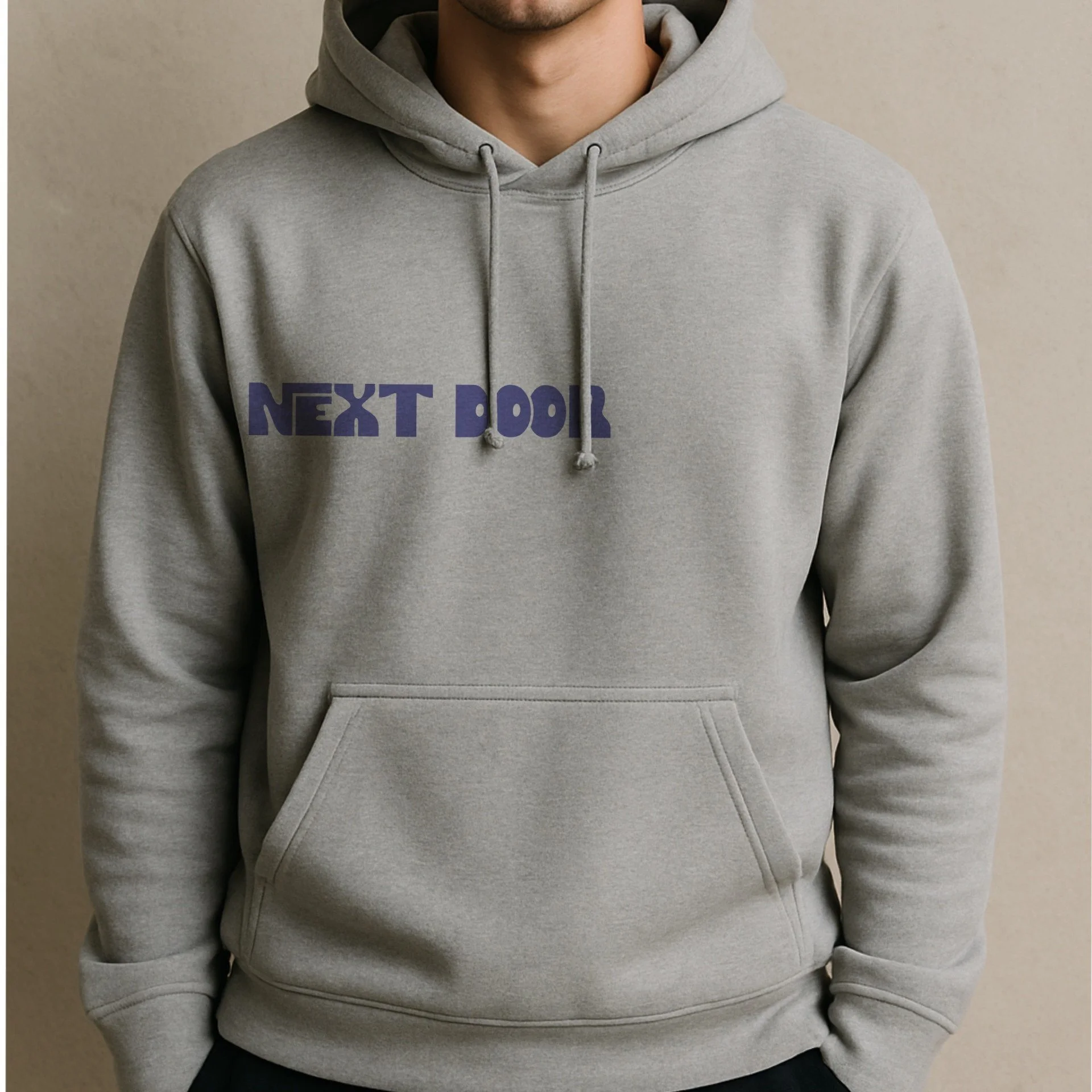
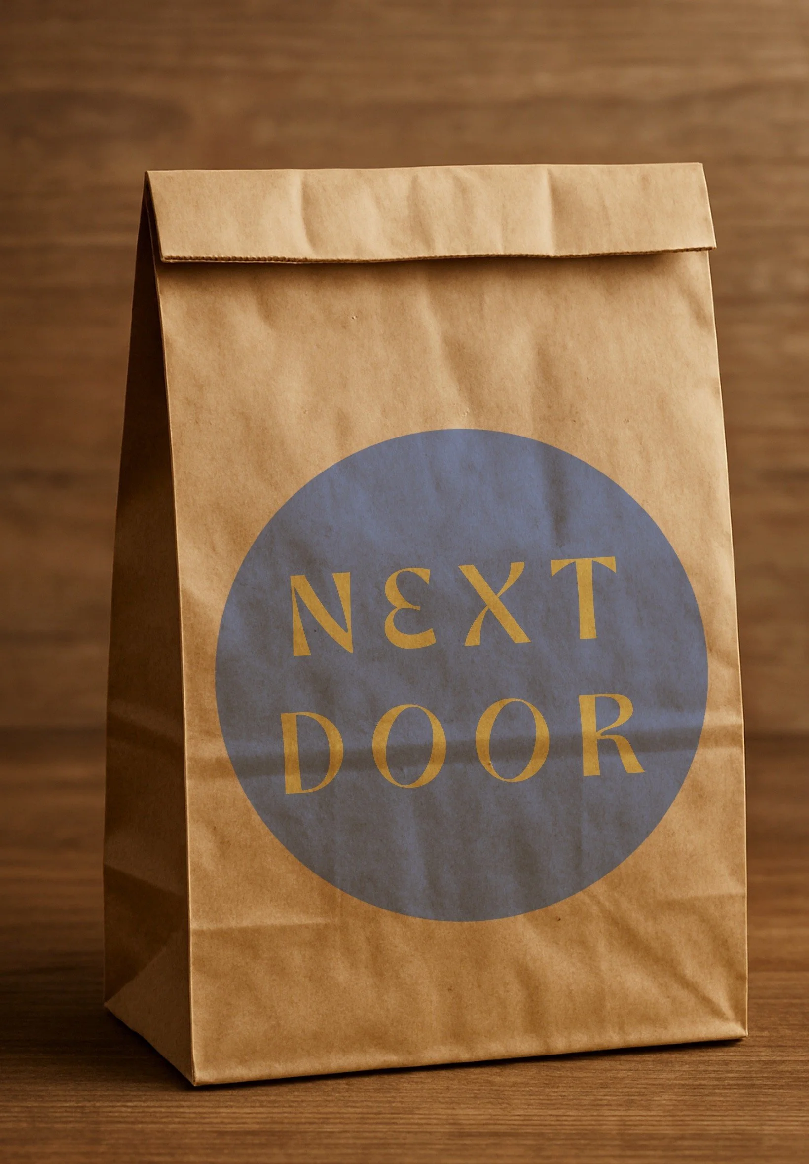
following finishing the business cards, i then moved onto creating some merchandise, like bags for the store, and clothing. to create these, I used Canva and Procreate.
In terms of group work and communication, I think that we all worked well together, and the resolution of conflicts was manages efficiently, to keep the project moving. Using the Myers-Briggs assessment worked well, as all aspects of what a team needs to be, was covered.


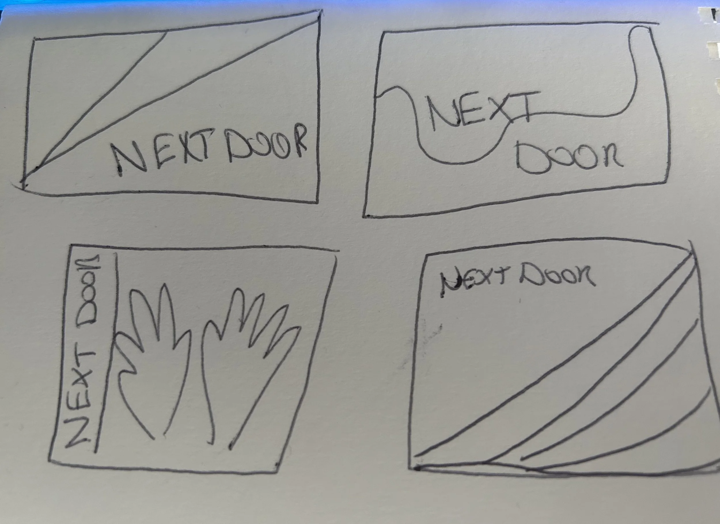
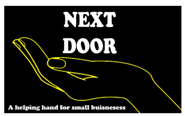
These are mid-fidelity draft logos made by me. The initial idea of hands came from deciding our slogan would be a helping hand for small businesses. The first logo was based on organic shapes, and recent trends within younger generations; however, we decided that this didn’t fit the feel of Next Door as it felt more towards a social media management company, or something to do with skincare.
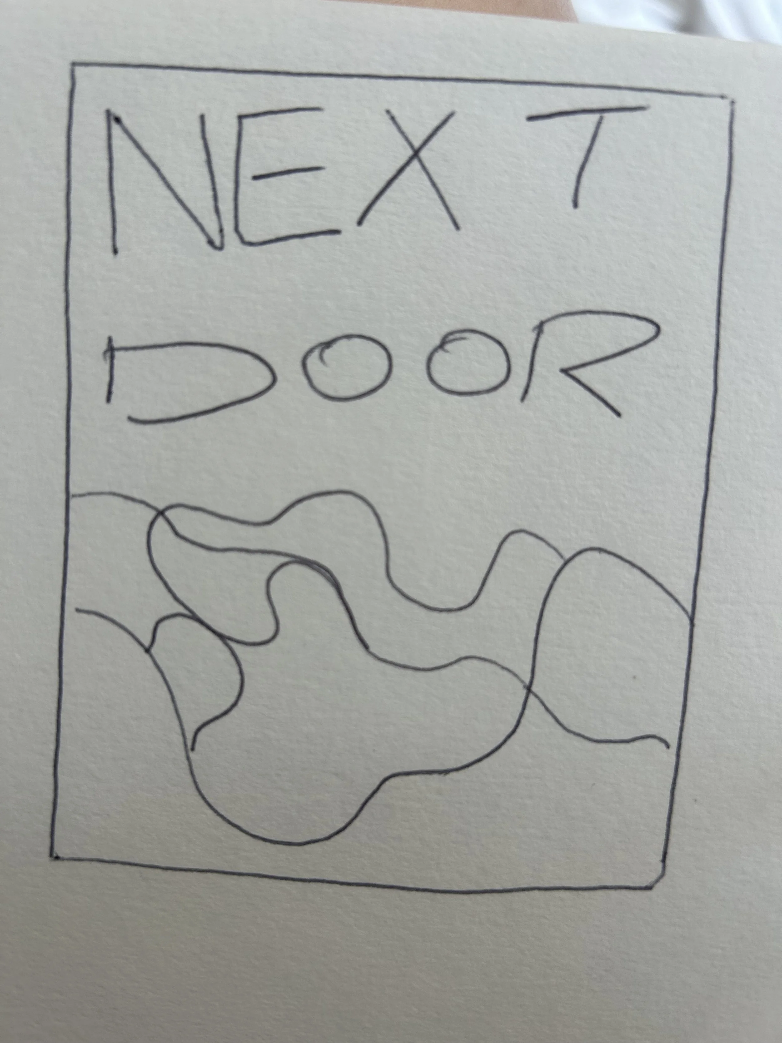
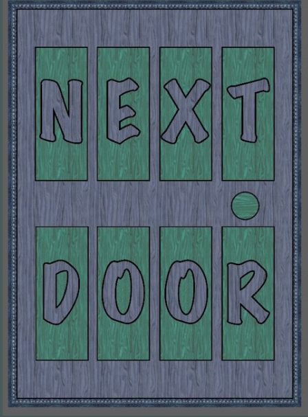
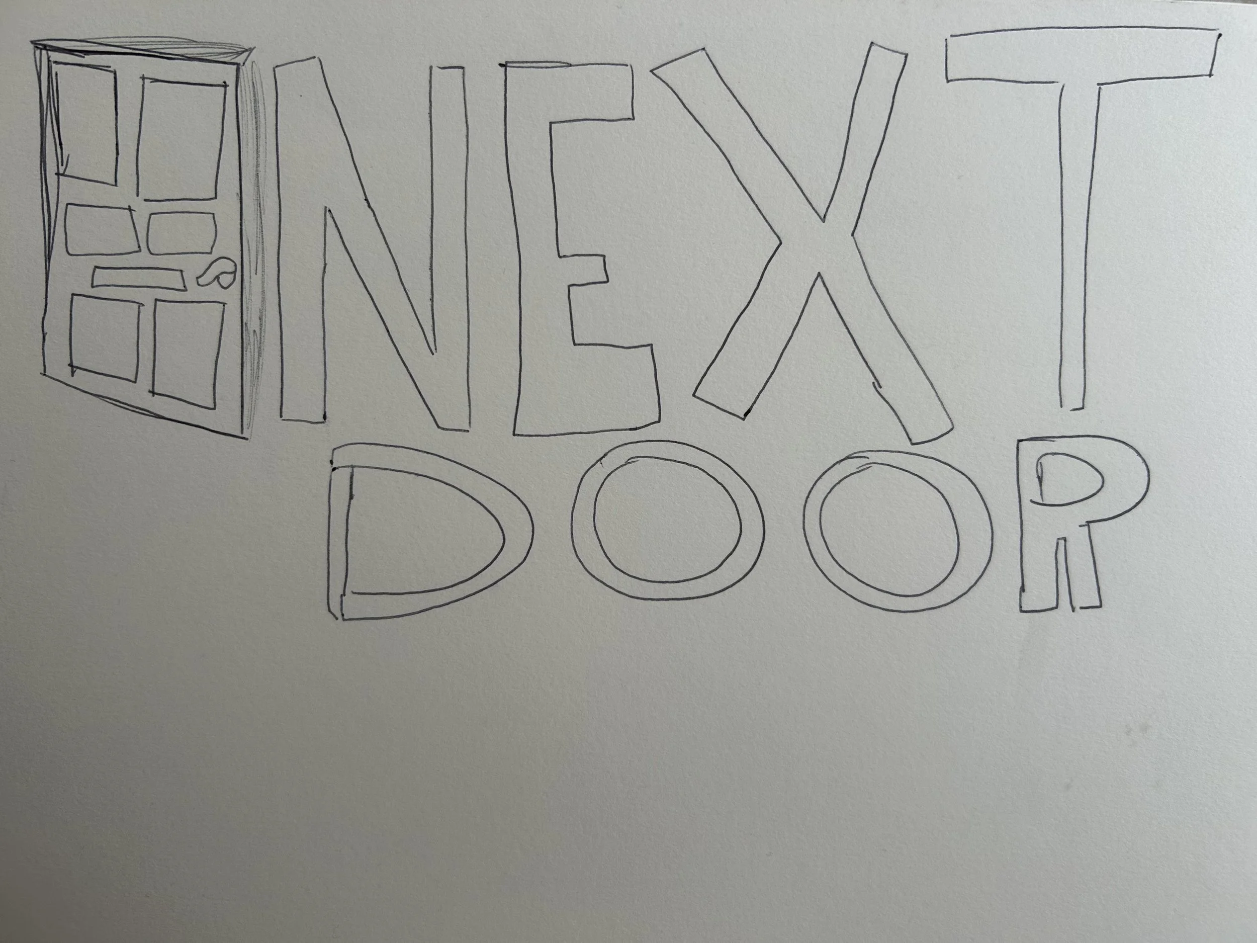
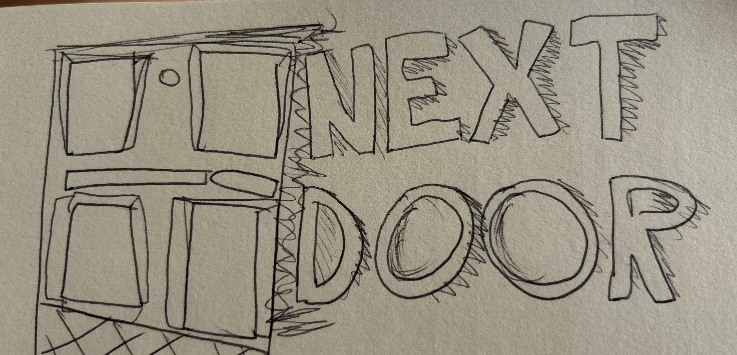
Below are some low-fidelity sketches i initially made. I never developed these ideas further as we concluded it would be best to stay away from having a door in the logo as it may present more like a furniture business.

My Tasks within the project were to create merchandise designs, and marketing materials, like posters and bags etc.
I began by making the business cards. I started by making these as they are usually quite plain, and I could put the brand guidelines into practice and solidify exactly what the brand looks like to me. From this, I could then extend the design into the website and social media to keep the brand looking the same across all platforms.
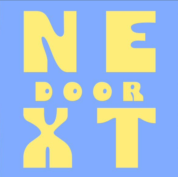
Above are logos designed by Ethan, myself and Jake. These are all initial logo designs we did not take these designs further, as again, we felt they didn't fit the feel of Next Door. We wanted it to feel fun and friendly, and felt the first and last design didn’t fit that theme. When looking at the middle logo, we all agreed that the colours used reflected Next Door well, so although we decided to use a different font in the end, we kept the colour theme used.
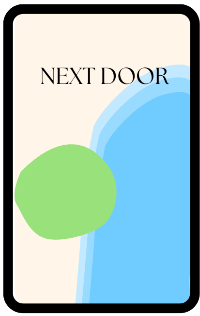
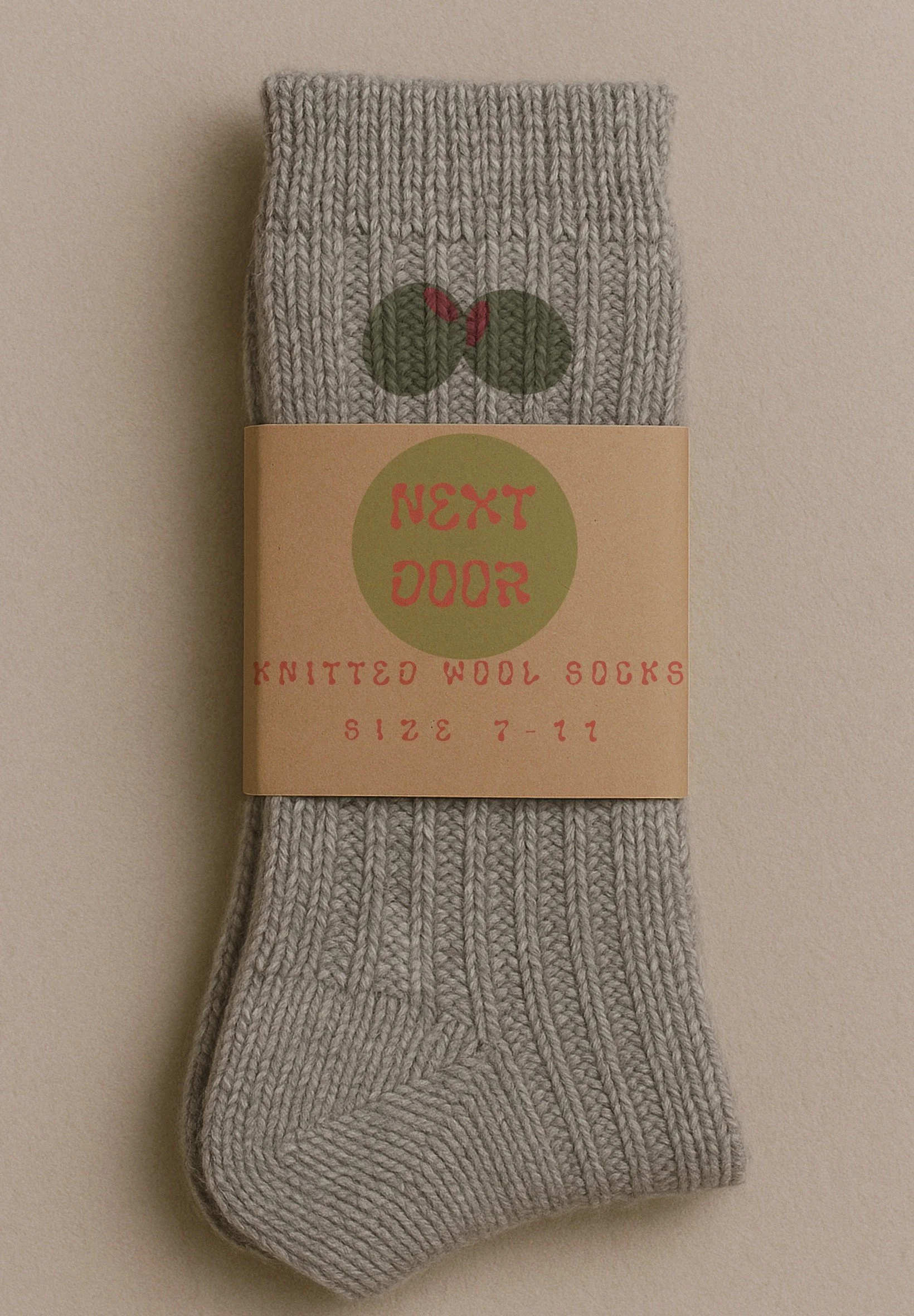
(final logo designed by Jake, included in Brand Guidelines Appendix A)
These are the final business cards, the left being the front and the right being the back of the card. I used a range of blues that we chose for the brand because, according to colour theory, ‘Light blue is a peaceful, calming colour. According to colour psychology, blue is associated with trustworthiness and reliability.’ (Canva). This is exactly what we want people to feel when they look at our brand as the fundamentals of Next Door are small businesses trusting us and relying on our pop-ups in order to grow their business.

below are posters made by Holly and Jake, to show a comparison of different work made for the same brand. This emphasis show how each individual interpreted the brand differently.

Upon reflection, I feel that overall, it was successful, and we have creates the fundamental design aspect to launch a brand while keeping SDG 8 in mind. I do believe, we wastes a lot of time in the beginning, stuck on the logo and feel we all got too focused on that, rather than looking at the bigger picture, of Next Door, which, in-turn, led to us having less time to complete other aspects of the project.
On a personal note, I feel as though i could have used a bigger variety of software, such as, Adobe Illustrator/Photoshop, and Figma to really help me increase my skill level. Although I am somewhat pleased with my outcome, I do feel as though i could do better. I think some personal goals for myself will be, time management, and push myself out of my comfort zone to use different designing software. I do like my work, even though it’s hard to not compare to others when in a group with such amazing designers. Ithink everyone in my group did well, but for my own work I think its just Okay! This is something I will work harder on next year.
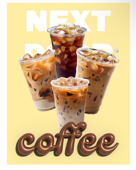
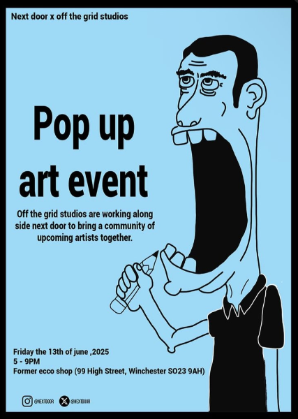
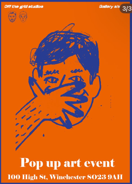
the final thing that I creates, were some posters promoting pop-up events, I used ProCreate to design them.
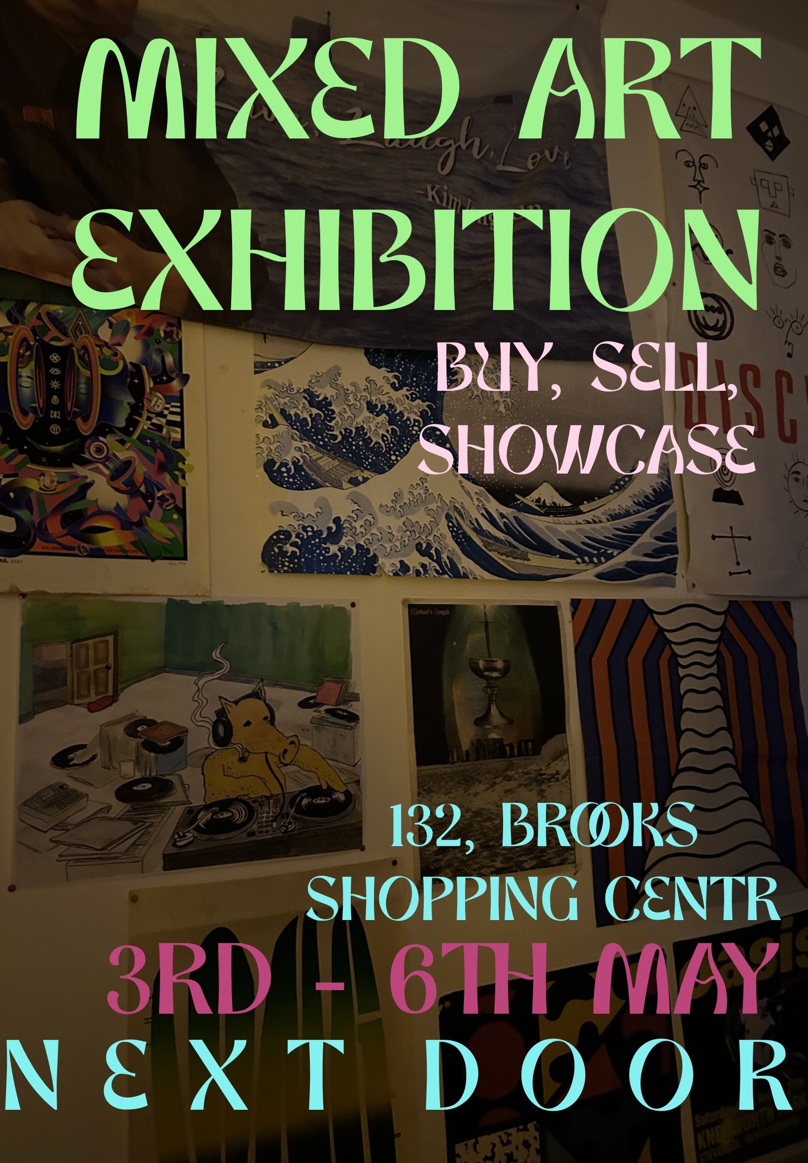
Using images I took from my device, I creates these posters using Procreate. On the left, is a poster for an art exhibition, and on the right, is a poster i made of an existing band called “Pugwall”. I feel like the way I designed is very youth orientated, when I designed both of these posters, I was mainly using my own sense of style and in turn, not really focusing on the later age group of out target audience. If I were to redo to create different posters, I would make them easier to read and not have them be so busy.